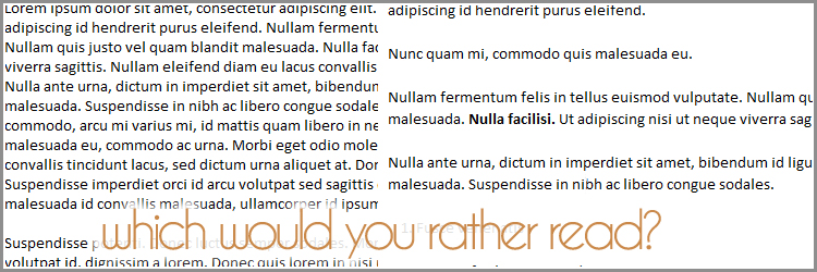
Have you ever come across a blog you loved what they were saying but just trying to read it exhausted you?
You have 3 seconds to impress your readers. Even if you have caught them by your web design and your headlines if you haven’t take these 5 simple steps in improving your blog posts your readers are going to leave.
1. White Space
In art and design there is a term called white space. This does not mean literally the color white. But just empty space, with nothing in it. This gives the eye a place to rest.Make sure that your blog design has space between each line (aka line-height). You also want to have a good amount of space between your paragraphs. Putting space around even your images will make a difference fo your readers when looking at your blog.
2. Short Paragraphs, Short Sentences.
When someone looks at your blog and see a wall of words, they become overwhelmed and tired just thinking about reading your blog post. Most readers only skim posts but if they see the wall of words they may just skip it all together. Use short sentences.
Make your paragraphs are short. They should only be a few sentences each. You cannot overdo paragraph breaks!
You can even make a paragraph just one sentence.
3. Edit, Edit, Edit
Make sure and edit your posts. Read your posts out loud and really listen to what you are saying. Can you write your sentences shorter? Can you use less words to make the same point? Less is always more and in blogging this is even more true.
4. Use Your Tools!
Use the edit tools in your blogging control panel. Make the key point in a paragraph bold. If you want to emphasize a point put it in italics. Most readers only skim text on websites. These emphasized points may catch their eye and encourage them to read more.
5. Lists
Use lists whenever you can. If you are joining in on the 31 days to Build a Better Blog then you have just learned that lists are great blog posts. But make sure even your lists are easy to follow. Try using bullet points or number your list. Make sure each item has its own line! Even when making a list and then expanding on each point your list item should have it’s own line.
Your Turn
Try out some of these tips on your next blog post and take a look at the difference. Does it look nicer to you? Did more people stop and comment on your post? Did you notice people even commented about something in the middle of your post vs the beginning and the ending?
I would love to see your posts showing off your editing skills, please comment and share your experience with me.


Pepper,
Reading this has given me awesome insight into how I can better format my blog. I knew I only had a short time to convince my readers to stay on my page but i never realized it was three seconds! I am going right how to check my white space and to take inventory on my sentences. While I edit edit and edit some more, my sentences can run on…
Thanks so much for the tips!
Yes this is just like in person, people jump to conclusions pretty quickly. The only thing about blogs is that they can just leave vs in person they are stuck talking to you (unless their rude).
Great info! I just did a list post yesterday and it seems fairly popular.
Great post and a well-designed blog, I might add. I struggle with the white space issue – I’m a wordy gal. My only caveat is that while editing for visual appeal is important, I would add that folks shouldn’t edit at the expense of good content. Content is key, as they say – so if chopping down a sentence or paragraph sacrifices the literary quality – I say keep it, white space be damned 🙂
I will definitely take your tips into consideration, as I am always trying to make my blog better for my readers. I am definitely a believer in white space and short sentences and paragraphs. I know how I feel when blogs are difficult to read because the words are too close together, or the post is too long and tedious. I also am a big fan of lists. Thanks for these tips!
Thanks for the tips! I’ve tried white space with my blog but need to work on shortening sentences. One thing I like on blogger is the “read more” feature, so each post is shorter on the home page. Visiting from SITS =)
Another great post of ideas! Your killing me with all this awesomeness, lol. I agree with short paragraphs. They are much easier to read : )
Just in time I read your post. I am also following the 31 days to Build a Better Blog.
I am doing big changes on the blog,
There is one big BUT. I have not the skills to change the fonts as I would like to. BUT I will find out.
Thanks for your post.
Thanks for all these amazing tips. New to this but have come across quite a few blogs that I just don’t bother to read. I know the content will be there, from prior reading, but most days it is just too much without a “gotcha” at the start.
I try and do short paragraphs or sentences and am trying to do more bullet points.
You do a great job catching your readers attention and keeping your paragraphs short. The only other suggestion I would have for you is to not center all your text. This makes it really hard for people to read. We are trained to read from the left edge when their is no left edge our brain gets confused and makes the reading hard.
Thank you, love feedback and advice. So lookout for text changes!