Have you really looked at your blog lately? Is it time to start freshening it up but you are not sure where to start?
Start by taking a look at the 7 major elements of your blog.
Logo
When someone is visiting your blog you have 3 seconds to give them their first impression (this is one reason you want your blog to load fast). A logo should tell your visitors in 3 seconds what to expect from your site. What’s the name of the blog and what is the style of the blog (ie. bold and bright, simple and clean, fun and crazy, crafty, etc.). You can say a lot in a logo.
You also want to make sure your logo is timeless and can be used for multiple kinds of media. Your logo should be able to be used for your blog, twitter background, facebook page, business cards, magazine articles, your pr package, an ebook, and more.
Think about the logos you see large companies using. When you see the Nike logo you recognize it instantly. When your readers and advertisers see your logo they should instantly know this is you!
The first thing when you come to the design of your blog is to invest in a professional logo.
Learn more about the 4 Options for Creating a Logo
Header
After your logo the next major element to look at in your design is your header. Current trends are slowly changing from large headers to just logos. One reason for this change is because big headers are taking up important space on your blog with very little information. The second reason is that designs are becoming more simple and clean.
If you are a believer in above the fold theory, which usually I am not, you are loosing prime realty on your website with a large header. You could be loosing space that you could sell to your advertisers.
I believe that if you make your header interesting enough you can make it any size you want. But I also believe in keeping it simple and that is hard to do with a large header.
Learn more about 7 Trends in Header Design
Slider
Sliders can show off three or more of your best posts quickly and dynamically. You can find lots of themes with sliders built in or you can find a WordPress plugin that will add it for you. A slider can cause your homepage to load slower so you do need to consider this when considering adding it to your blog.
Navigation
Once you have gotten your visitors hooked into staying at your site longer than 3 seconds now you want them to take action and visit the other parts of your site.
For your navigation keeping it simple really is the key. You want your readers to instantly be able to tell that your menu is a menu. Make the buttons and links easy to read and easy to click.
Keep the menu items short and try to avoid being too cute. Use real words that a reader who has never been to your site will instantly recognize. Three items I recommend for every blog are About, Categories, and Contact.
But the most important thing of all is to make sure there is a home button or your header is linked to take them home. You don’t want your visitors to get lost on your site.
Posts
Posts should be easy to follow and easy to read. Make sure that you don’t overwhelm your readers with too many posts on the front page. If they are not going to connect to your blog within 10 posts then they just are not the right audience for you.
When you look at your posts they can be broken down to 5 basic elements:
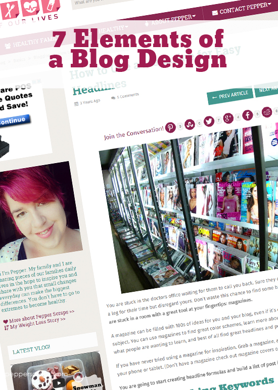
- Headlines – Headlines (or post titles) should be bold and easy to read. Most readers will scan through your headlines and pick out the articles that they want to read. Learn how to use a magazine to improve your headlines.
- Content – The post itself should be easy to read and have lots of white space. Learn more about 5 Ways to Visually Improve your Blog Posts.
- Post Footer – This is the place to put your meta data. Make sure that your tags and categories are listed so that when your reader finds an article they connected with they can find more to read.
- Comments – Make sure your comment link is easy to find. Most readers expect to find the comment links at the bottom of the post. Plus it’s easier to click a link right after reading something you enjoyed then scrolling right back to the top.
- Social Share Buttons – Make it easy for your readers to share your posts. Use a plugin that gives you each of the social media sites that you want people to connect with your posts. Try and make sure all the share buttons are all in one place. Also do not over do the options. You don’t want to overwhelm your readers with options and buttons.
Sidebar
- Social Media (learn how to add social media icons)
- Newsletter Sign Up
- Advertisers (less is better)
- Quick Introduction
- Popular Posts
More than this can start making your site look busy or cluttered. Again white space is very important in your sidebar. I have written a post about sidebars in my post How Much is Too Much? Let’s talk sidebars.
Footer
If you have an editable footer then this is a great place to put items like your tags, categories, and extra buttons. I would not put more than four sections in your footer and only place one large item in each section.
The Next Step
Now that we have reviewed the 7 elements of a blog it’s now your time to take a look at your blog and see what needs updating and cleaning.
If I’ve talked about a section in your blog that your just not sure what to do with subscribe to my blog. I will be breaking out each of these elements into their own posts and you can learn more how to improve your blog or website.
If you have any questions you want to ask right away please post them in my comments.


I love that above the fold website! Great article!
I love that article, what’s funny is I always loose it and then search and search for it, because there is nothing else like it!
Thanks, these are very helpful! I’m always looking for ways to improve my blog, and always asking myself what people think when they see it and read the content.
I will hopefully be writing an article about how people read through your blog also. Here is a hint, the letter F.
see now this’ll help me in getting my site fixed up. 🙂 you’re like my biggest inspiration when it comes to all that blog design jazz. 😛 ♥
Aw, thanks, I hope this really does help you! I’m hoping to break down each of these elements also.
I love your posts! However they always make me want to change my blog around. You make me want to be better, which is a good thing!
That is exactly my goal, I want to help mommy bloggers love and respect their blogs by making the best they can be. Thank you for letting me know I’m making my goal!
Really great post! Helpful! I’m going to share it tomorrow in my Friday’s Findings!
Thanks N0elle! I really appreciate that.