One thing that can make or break your navigation on your blog is your categories. When you are starting your blog you should draw out a road map for your categories. If you organize your categories on paper first then they will not get out of hand. If you have been blogging for a while and didn’t start your …
7 Elements of a Blog
How to Use a Magazine for Easy Headlines

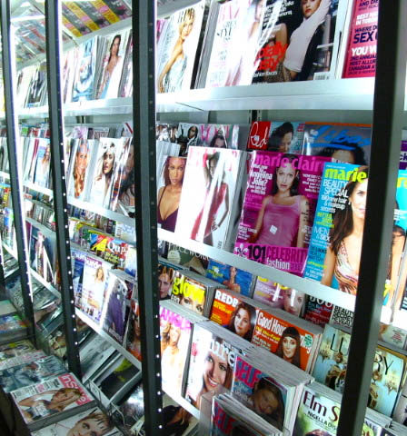
You are stuck in the doctors office waiting for them to call you back. Sure they charge you an arm and a leg for their time but disregard yours. Don’t waste this chance to find some blogging inspiration. You are stuck in a room with a great tool at your fingertips: magazines.
A magazine can be filled with 100s of ideas for you and your blog, even if it’s on a completely different subject. You can use magazines to find great color schemes, learn more about layouts, find out about what people are wanting to learn, and best of all find great headlines and post ideas!
If you have never tried using a magazine for inspiration. Grab a magazine, a pen and paper or I like me your phone or tablet. (Don’t have a magazine check out magazine covers on Amazon.com.)
You are going to start creating headline formulas and build a list of post ideas.
Use Eye Catching Keywords
Original Headline: Have a Stress Free Summer (Good Housekeeping)
Basically Stress Free is your keywords here. So your formula will be Have a Stress Free ________. When I write my ideas down on my tablet if I don’t have an idea instantly I will leave blanks.
My Examples:
- Blogging twist: Have a Stress Free Editorial Calendar
- Kids twist: Have a Stress Free Play Date
- Weight loss twist: Have a Stress Free Date Night on a Diet
Original Headline: Sexy Hair Made Simple (InStyle)
Your formula: ________ Made Simple
My Examples:
- Blogging twist: Categories Made Simple
- Weight loss twist: Grocery Shopping Made Simple
- Social Media twist: Facebook Pages Made Simple
Create a List Formula
Original Headling: 285 No-Fail Ideas to Scrapbook (Creative Keepsakes)
Quickly create your formula: # No-Fail Ideas to ________. I don’t actually add the numbers until I start brainstorming and come up with how many items I will have in my list.
My Examples:
- Blogging twist: 10 No-Fail Ideas to Blog Posts
- Weight loss twist: 5 No-Fail Ideas to Get Your Exercise
- Social media twist: 8 No-Fail Ways to get Followers
Original Headling: 12 Sneaky Tricks to Peel Off the Pounds (SELF)
Formula: # Sneaky Tricks to ________.
My Examples:
- Blogging twist: 7 Sneaky Tricks to Get Comments
- Weight loss twist: 13 Sneaky Tricks to Healthy Snacking
- Vlogging twist: 3 Sneaky Tricks to Awesome Videos
Great Phrases
My Examples:
- My blogging twist: Headers! How to Create your Own
- Kids twist: Bubble Wands! How to Create your Own
- Social media twist: Icons! How to Create your Own
My Examples:
- Blogging twist: More Subscribers Instantly
- Weight loss twist: More Protein Instantly
- Social media twist: More Privacy Instantly
See how quickly and easily you can start building ideas and creating great eye catching headlines? The best part of this is you can do this in a few minutes or for a half an hour. It’s quick to pick up and put down.
What’s your favorite way to find blogging inspiration? Have you used a magazine for inspiration before?
How Much is Too Much? Let’s talk sidebars
A chronic disease of that many bloggers have caught is cluttered-sidebar-itis. Have you caught the disease? Let’s talk about how much is too much in your sidebar and how to know what you should add and what you shouldn’t. Even taking a look at my sidebar I realize I need to do some spring cleaning.
The best way to start is to look at your sidebar and ask yourself:
- How does this benefit me, my blog, or my readers?
- Could I put this somewhere else on my blog?
- Does this blend with my blog design or does it distract?
5 things you should have in your sidebar
- Social Media – You need people to know how to connect with you! I would put this in your #1 spot on your sidebar. Don’t know how learn, it’s really easy.
- Call to Action – Call to action is a great place for one specific goal you have your blog. Are you wanting more Facebook Followers? Add a Facebook widget. Looking to sell your eBook show it off in your sidebar. The key to this section though is to only have one call to action.
- Search – If your readers can’t find what they are looking for in a few seconds you are going to loose them. Make it easy and include a search on your sidebar. Make sure this is close to the top also, no one is going to search for a search box.
- Newsletter Sign Up – Don’t have a newsletter, maybe it’s time to consider one. That’s on my to do list for this summer. Learn more about how to use a newsletter.
- Paying Ads – The keyword here is paying. I know you love your bloggy friends, but this is valuable space! Don’t overdo your ads. Make sure you are charging enough for your space that you don’t look like your selling out to your readers. I would limit your ads to about 4-6 ads.
5 things to consider putting in your sidebar
- About You – Share a little something about you or your blog. Make it short, if you want to say a lot link it to your about page. Make it interesting, this would be a good place to use your tagline. You created it to catch new readers, use it here to take
- Featured and/or Popular Articles – If you want both on your sidebar make sure you use a tabbed widget so that it doesn’t fill your whole sidebar.
- Categories or Tags – Same above you should have one or the other not both in your sidebar.
- About Video – This is the newest and coolest thing to do. Instead of an about you section have an about video for your site.
- Polls – Polls are great way of interacting with your readers, learning more about your visitors, and giving your readers something to look for updates on.
5 things to delete from your sidebar
- Blog Roll – I know you love your friends and have some great blog finds, but really the best place to share these is on their own page.
- Badges or Community Buttons – You are using up valuable space to give these communities free advertising. Create a page about the places you have memberships and awards you have received.
- Too Many Ads –
- Ugly Widgets – Just because your favorite website offers the option for you to add their widget it may not be the best to do it. Unless you are getting something from the widget and you have the option to make it look good and look seamless just don’t add it.
- Your WordPress Login – Unless you have an open sign up for your WordPress there is no reason for you to have the login in your sidebar. It’s really easy to bookmark your login page and take out this section no one but you uses.
7 Trends in Header Design
Your header is the second most important design element of your blog, #1 being your logo. You want to catch your readers attention and tell them something about your site within the first few seconds of loading. Your header is the best area to do this. What kind of header do you have? What kind of header should you have?
Changing Trends
I have talked before about how header trends are changing. Headers used to be large and take up at least half of the screen, but now you will find all kinds of styles. Everything from the traditional to just the simple logo. These changes started because people started using the Above the Fold Theory.
Above the Fold
This is a theory from the newspaper age: that the top half of the paper that is visible when folded should hold your most important story and photography. When this started transferring into web design people started squishing as much stuff as possible in the top of their site. All this did was to make things cluttered and destroy the beauty of the design.
Current thought has started changing. Designers realized people are getting used to scrolling and will look at the whole site. Why should we not start spreading out the elements of the design to make them easier to see and make them eye catching.
From this evolution of design we have gotten tons of new header trends. Let’s take a look at the seven I found.
Traditional Header
The traditional header is still in use, it may not be half a page anymore but it’s still here. This is a great way to either tell a story, showcase your style, show off photography talent, or as above display an artistic ability.
The Small Header
The small header is a hybrid of the traditional header. People loved the space to showcase their photos and personality, but they wanted their visitors to be able to get straight to the content. Creating a smaller, half-sized, header will give you the best of both worlds. This is also a very popular style.
Logo Only
The extreme opposite of the large headers is just placing a logo at the top of your site. This gives lots of space for ads, call to action and content. The content is right at the top so visitors can jump right in and read. One nice feature of the logo only header is that it creates a clean and simple feel.
Featured Section
With all the added space that web designers got from loosing the large headers they realized they could create new elements. One of these elements was a section to feature the newest blog posts, favorite article, or a product (as Darren is doing on his site).
Slider

Another element created to fill up the space from the age old headers was j Query sliders. Sliders are very similar to feature sections but more dynamic and interactive. Usually you will find three to six slides that either slide automatically or by the press of a button. A slider can feature the same posts, articles, and products as a feature section, but adds more content in the same amount of space.
Instant Call to Action
One of the newer trends is to create an instant call to action area. You can use this section to invite your visitors to learn more about you, to buy your book, or to try out a product. You don’t see call to action sectionss on blogs as much as you do on basic web sites.
Typography
The amazing things you are now able to do with fonts in web design has created a new trend: typography. The art of typography is a big trend this year and it will be interesting to see if it continues as more fonts become available. This is also not something you see as much on blogs.
Conclusion
Those are the 7 trends I have seen in web design for headers. Do you have any good examples of headers that fall into these categories? Or do you have a trend that I missed?
What is your favorite header style as a reader? What is your favorite style as a web site owner?
Updating a Key Page: All About You
Have you ever read Darren Rowse’s 31 Days to Build a Better Blog ebook? If not you have to it is amazing. Today I’m going to share my incites on Day 14 of the book. I will be sharing this with other’s who have read the book with me, but you can follow along even if you haven’t had a chance to read the book.
Day 14 of the 31 Days to Build a Better Blog you are asked to update a key page. Darren gives you multiple pages that you can update: front page, about page, contact page, or a high traffic page. Let’s focus in on your about page.
How important is your about page? You’ve got your readers attention, where will they go next? Of course they will click your “about” link in your menu. They want to learn more about your blog and about you but really they want to know what they will get from reading your blog.
I will give you an easy formula on how to build an awesome about page that will encourage your new readers to stay longer and subscribe.
5 Elements of an Awesome About Page
I will be using some of the great tools that you have already developed as you have made it through the previous 13 days of the 31DBBB. Plus we will throw in a couple extras.
- Updated Photo
- Tagline & Elevator Speech
- A list of What’s In It For Me (your reader)
- List of Top Posts
- Call to Action
Let’s Get Started
I’m going to walk you through how I updated my very boring about page:
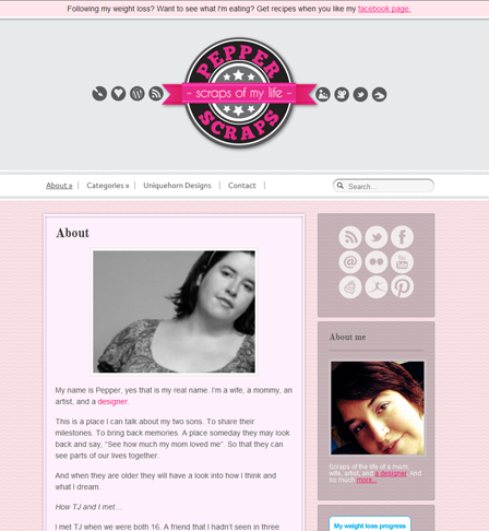
The Original Page

A very typical about page, even I have to admit it was boring. I talked about me, how I met my husband, about my boys, and other things. The page was all about me but basically it was a life story. I wasn’t really sharing very much about what my blog was about. Now it’s time to update it.
Step 1: I Updated my Photo

Use a recent photo that is high quality. If you don’t have a current photo or a photo that is high quality then find someone who can take one for you (if you are not good at self portraits). Find a professional to take a few head shots for you or ask your friends and see if any of them can take a high quality photo with a good camera.
Make sure your photo matches the feel of your blog. If your blog is funny and happy share a picture that is bright and full of joy. If you are writing on a very serious topic make sure your photo has a somber and quiet feel.
Step 2: I Started with my Tagline and Elevator Speech

On Day 1 of 31DBBB you wrote a tagline and elevator speech for your blog. You can now describe your blog with a few short words (tagline) and with a short paragraph (elevator speech). This is great for when you are meeting people and trying to describe your blog but this is also great for your about page.
Even though you have already gotten your readers attention you want to keep it. One of the best ways to start out your about page is to recapture your reader in a few seconds and make them want to read more. You have created a quick and interesting description of your blog, use it!
Step 3: I Created a List of WIIFM

Now that you have described your blog to your reader you need to tell them what they gain from reading and/or subscribing to your blog. On Day 2 of 31DBBB you learned why to use lists; they are easy to scan, succinct, look neat, and are persuasive.
You are going to create a list that explains what your reader gets from your blog in an easy to read format. A list is going to catch your readers eye and you are going to use it to persuade them to subscribe to your blog. You can use anywhere from 5 to 10 points explaining to them what you are offering them.
Step 4: I Gave my Readers a List of Top Posts

At this point your reader should be ready for some more content. They have learned why they should read your blog now prove it to them by sharing a list of your top favorite posts. Make a list of your top favorite posts or if you have the stats on your posts the top most popular posts.
On Day 8 of 31DBBB you learned about the importance of interlinking your posts. Not only will this help your reader find your best content, but it will also help with SEO and page views!
Step 5: Lastly I Called my Readers to Action!

Further along 31DBBB you are going to learn more about call to action or you can learn right now at Smashing Magazine. Basically you are prompting your reader to take action!
Your reader has read through your whole introduction, now is the time to tell them what to do next!
This would be a great place for you to ask them to subscribe to you, subscribe to your newsletter, to follow you on twitter, or to like you on facebook. Choose only one to three of these, don’t overwhelm them with too many options. Make it quick and easy.
Your Turn
Now that I have walked you through updating my page I hope you will now feel like you have the tools to update yours. When you use these steps please share your about page in the comments, I would love to see your outcome!
How often do you visit the about page on a blog you are visiting? Do you always read the whole page? Do you have an example of a great about page?
How Important is Color on Your Website?
Colors are so important in your website design. Color can make all the difference. Colors can change the tone of your site, emotional effect your readers, and colors can make your site unique and stand out!
Find your colors!
When looking at color for your site you should think about creating a color palette. In design and branding you always want to try to make sure you are using only 3-5 main colors. When you start getting over 5 colors things start to become too busy. You also want to make sure that at least one or two of your colors are neutral.
Now if you want to create your own unique palette but don’t know where to start, look around you. Look at some of your favorite clothes, look through your favorite magazines, or look at some of your favorite websites. You may be surprised where you can find inspiration.
If you hire a designer to create your layout make sure to ask for the hex codes for the colors in your site.
If you do not have the colors that are used on your site you can use some different tools to find the colors. If you have a header that has all your colors or take a screen shot of your site ( fullscreen). You can visit PhotoCopa and find your color palette by uploading these images to this great tool.
Use your colors!
Use your colors in everything you possibly can. Change the colors on your google friends widget, on your blogfrog community, and if their is an option of editing on an item you are putting on your site use it.
Make sure all your buttons match your palette. Use these colors on your twitter page, facebook page and other external social sites. As an example, when your readers go to your twitter page if you are using the same colors they are going to instantly know this is you! This is where they want to be!
Examples
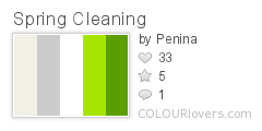
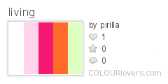
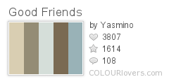
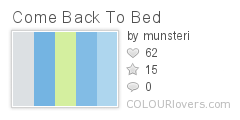
My personal favorite tool is Colour Lovers. This is a great community. You can create your own palettes or you can use pre-made palettes. If you have a color that you know you want to use, you can search for a palette with that color. Another great thing is that people can vote for color palettes, so you are able to see what palettes are popular.
Just while writing this post I found these five great color palettes:
More Resources
Are you ready to go find new colors for your site or for your next design? Trying to find the colors on your current site? Just love color? Here are some great resources:
Color Combos
Color Scheme Designer
Color Schemer
I could keep going but you can see a comprehensive list at Aviva Directory.
[box type=”info” style=”rounded” border=”full”]Originally posted on my blog at Uniquehorn Designs, but that blog will be closing and moving to PepperScraps.[/box]









You must be logged in to post a comment.