putting the pieces of life back together

Showing: 1 - 6 of 6 RESULTS
How to Invest in Your Blog Design Beauty vs Budget
Basics Blogging How to Start a Blog

Beauty vs Budget: How to Invest in Your Blog Design

How to Invest in Your Blog Design Beauty vs Budget

When you are start considering designing or redesigning of your blog you can be faced with a lot of questions. One of the first questions you should ask is how much should you invest in the blog design.

[Tweet “Question #1 when considering your blog design: how much should you invest?”]

You have four main options for choosing your design a free WordPress theme, a premium WordPress theme, a customized premium WordPress theme, or a customized WordPress design. We will be exploring the pros and cons of each of these to help you decide how much your site is worth to you and how your investment will benefit you.
perfect home
By mccheek

Free WordPress Themes

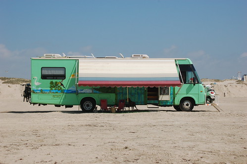
Just like a mobile home a free theme will have predesigned colors and style and it may not match you and your style. Plus hundreds of the exact same blogs are out there due to the theme being pre-constructed. But just like a mobile home you can live in it for a time until you run out of room and you are tired of that one cupboard that just won’t stay closed. Especially since it was offered to you free from a relative.

Pros:

  • Free
  • A free theme is better than a default theme
  • You can find lots of free themes to choose from
  • Even my favorite theme provider offers free themes. (MyThemeShop (Affiliate Link))

Cons:

  • Doesn’t really represent you and your brand
  • You will not have as many options for customization
  • Attempting to customize the theme yourself it may just not turn out right
  • Your images and style may end up feeling mismatched and disjointed
  • You may see other bloggers using the same theme
  • The theme may not fit your needs exactly (ei. menus don’t fit, colors don’t match, etc)
  • You can feel overwhelmed sifting through all the themes out there

Conclusion: A Free Theme doesn’t represent you and your brand but you can live with it.

Gt Yarmouth Beach 18-10-2008 16-21-43
ByMartin Pettitt

Premium WordPress Themes

Just like a manufactured home you can find a premium theme that is very inexpensive and you can choose the siding, the carpet and counter tops, but once you get it into the mobile home court you realize your home looks just like some of the neighbors homes. But you at least you have a home that has new appliances and keeps you dry. This may work for a time until you realize that you are tired of your friends getting lost every time they try and find your house and it becomes time to upgrade your fridge.

Pros:

  • Very Low Cost
  • You will find more features than a free theme
  • Premium themes tend to have a more professional look
  • You will have more options for customization

Cons:

  • Doesn’t represent you and your brand
  • You still may have troubles with customizing the theme beyond the basics
  • Attempting to customize the theme yourself may make it lose it’s professionalism
  • You may still run into other’s using the same theme
  • You can still feel limited by the options

Conclusion: A Premium Theme doesn’t represent you and your brand but it functions.

MyThemeShop 300x250

My favorite company to purchase themes from is MyThemeShop (Affiliate Link). I am affiliated with them, but that is only because I love them. There themes are amazing and the control panels for their themes are easy to work with and well made.
Suburban Homes
By LancerE

Customized Premium Wordpress Theme

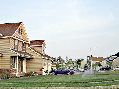
Just like a modern stick built home you can have a customized theme built for you.  A builder will give you multiple floor plans to choose from to create your new home. Then you get to pick the flooring, the wall color, the counter tops and the appliances. You get to have a home that really showcases your style and gives you some special functions you have been really wanting.

Even though you live in a house that may be the same floor plan as your neighbors your friends will still know which house is your house. Plus now you will not be embarrassed to invite your boss over for dinner.

Pros:

  • Low Cost
  • No one else will have the exact same design
  • Represents you and your brand
  • Professional customization makes your brand more recognizable
  • A Professional does the customization so your under less stress
  • Brands and readers can see that you have invested in your blog or site
  • Professional help cleaning up your layout and making it easier for your readers to navigate
  • You will have more options and functions that a professional can install
  • Sponsors will see you have invested in your blog and they will want to invest in you

Cons:

  • More of an investment
  • You may have to wait on a waiting list for your design
  • Still may feel cookie cutter as you see the same layouts at other sites
  • May take some time to find a professional that you feel matches you and your style

Conclusion: A Customized Theme starts building brand recognition and makes your site more professional.

Custom Built Home at West Shores - Omaha, Nebraska
By Omaha Homes For Sale

Custom WordPress Design

Just like a custom built home you can invest in a Custom Design. Your imagination is the limit. You can have any flooring, walling, appliance, and more that you could possibly want. You can change the floor plan to fit better with your needs and wants. You could even have a swimming pool built into your dinning room for swim-dining!

You can create a place that is all about you and your style. Your friends will know your home instantly even on the first visit and you will be inviting you boss over for monthly dinners just so you can show off your beautiful home and brag.

Pros:

  • The Design is all yours, you will not see anyone with the same design or layout
  • It is obvious you are invested in your blog or site, so users and brands will invest in you
  • You will find you will have unlimited customization and options
  • Everything coordinates and functions just as you wish

Cons:

  • Large investment
  • Have to do some homework to find the right designer that fits your style
  • Takes some time to create

Conclusion: A Complete Custom Design represents you with a unique layout and images and functioning.

I hope this gave you some things to consider as you are choosing the level of investment you want to make into your blog.

[conversation_embed]

Basics Blogging How to Start a Blog

5 Tools of an Expert Commenter

One skill in blogging that is forgotten or ignored is the skill of commenting. Making a comment that is eye catching, insightful, and engaging will help you build your community. Yes even going onto a blog that is not your own you can work on your community. Comments are a place that you can get interaction …

Basics Blogging How to Start a Blog

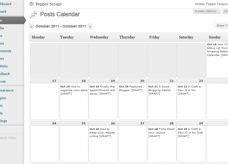
How To Setup Your Amazing Editorial Calendar

If you don’t have an editorial calendar you may find that your posting is sporadic, you may become stressed keeping up with posting, or you may get blogger burn out. Today let’s talk about how to avoid all three of these by setting up an amazing editorial calendar. You will find two benefits from a …

Basics Blogging How to Start a Blog

How to Find and Add Photos to your Posts

Photos can make or break your post. Humans are a very visual. Two of the first things that will draw your visitors to your post is your title (headline) and your photos.

How do you make your image draw a visitor in? By making sure you use a high quality and relevent photo. But where do you get these photos and how do you place them correctly.

Use your own photos!

Get your camera out and learn a few good tricks about photography. Find a book or ebook, take a class, or follow a beginner photography blog. But make sure that you only choose high quality photos.

Creative Commons Licensed Photos

BlueberriesBy quacktaculous

Creative Commons licenses are several copyright licenses that allow the distribution of copyrighted works – Wikipedia

If you want to learn more about Creative Common Licenses Lynda from Daily Window gives the best description and instruction I have read!

The best collection of creative commons photography can be found on Flickr’s Creative Commons.

One of the most important things to be aware of with creative commons is that you need to make sure and give credit for the photo. This is very important and if you do not do this you are stealing the original photographers artwork.

Find Royalty Free Photos

found here

Some photographers and designers are happy to share their work and offer it royalty free with no credit necessary. The only warning with these sites is that you want to make sure that the site you are using is legitimate! Make sure and read their terms of service.

One of my favorite sites that is free to find photos is stock.xchg. This site is easy to use, has great images, and the fine print is easy to find and understand. (The ones you can use with out linking back state: Standard restrictions apply.)

Word of Warning

Word of warning do not use google images as a source for your photos. It may seem an easy option to find photos through Google Images, but very few of the images are free for you to download and use even with credit.

Also never ever hotlink an image from another domain. Flickr does give you the code to insert the image so this is allowed. But any other site you are not allowed to take the URL of the image and paste it into your post. Or just copy the image and paste it in the image straight into your post. This is called a hotlink and you are stealing bandwidth from someone else.

5 Tips to Perfect Photo Placement:

  1. Know the size of your post area on your blog (400px, 600px, etc)
  2. Place your first photo in the same place on all posts (top center, aligned to the left or aligned to the right)
  3. Don’t use small images (try to make your top photo always the same size)*
  4. Don’t ever re-size your image larger! (You can make it smaller though)
  5. Do not let any photos hang over the edge of your post area

*How to Resize your Image

How to change the size of your image with a little html so that your photo fits. Remember don’t ever re-size your image larger always make it smaller or else you will lose the quality of your photo!

Your image is placed in your post with a small html tag (if you are using WordPress click the HTML tab to see this tag). Here is an example:

<img src=”http://YourDomain.com/YourImage.jpg” alt=”” width=”500″ height=”303″ />

To make your image fit inside your post area and not hang over you have to know the size of your post area (mine is around 450px). Change the width of the photo to be smaller than your posting area and take out the height all together. If you do not take out the height your image will get a warped look to it. Here is what your example would look like after being changed:

<img src=”http://YourDomain.com/YourImage.jpg” alt=”” width=”425″ />

Conclusion

I hope this helped you learn more about photos and your posts. Photos are a really important part of blogging. Make sure you get comfortable with using photos and using your tools to find them!

Where is your favorite place to get photos for your posts?

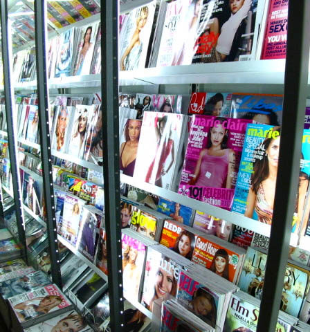
magazine covers
7 Elements of a Blog Basics Blogging How to Start a Blog

How to Use a Magazine for Easy Headlines

magazine covers

You are stuck in the doctors office waiting for them to call you back. Sure they charge you an arm and a leg for their time but disregard yours. Don’t waste this chance to find some blogging inspiration. You are stuck in a room with a great tool at your fingertips: magazines.

A magazine can be filled with 100s of ideas for you and your blog, even if it’s on a completely different subject. You can use magazines to find great color schemes, learn more about layouts, find out about what people are wanting to learn, and best of all find great headlines and post ideas!

If you have never tried using a magazine for inspiration. Grab a magazine, a pen and paper or I like me your phone or tablet. (Don’t have a magazine check out magazine covers on Amazon.com.)

You are going to start creating headline formulas and build a list of post ideas.

Use Eye Catching Keywords

Original Headline: Have a Stress Free Summer (Good Housekeeping)

Basically Stress Free is your keywords here. So your formula will be Have a Stress Free ________. When I write my ideas down on my tablet if I don’t have an idea instantly I will leave blanks.

My Examples:

  • Blogging twist: Have a Stress Free Editorial Calendar
  • Kids twist: Have a Stress Free Play Date
  • Weight loss twist: Have a Stress Free Date Night on a Diet

Original Headline: Sexy Hair Made Simple (InStyle)

Your formula: ________ Made Simple

My Examples:

  • Blogging twist: Categories Made Simple
  • Weight loss twist: Grocery Shopping Made Simple
  • Social Media twist: Facebook Pages Made Simple

Create a List Formula

Original Headling: 285 No-Fail Ideas to Scrapbook (Creative Keepsakes)

Quickly create your formula: # No-Fail Ideas to ________. I don’t actually add the numbers until I start brainstorming and come up with how many items I will have in my list.

My Examples:

  • Blogging twist: 10 No-Fail Ideas to Blog Posts
  • Weight loss twist: 5 No-Fail Ideas to Get Your Exercise
  • Social media twist: 8 No-Fail Ways to get Followers

Original Headling: 12 Sneaky Tricks to Peel Off the Pounds (SELF)

Formula: # Sneaky Tricks to ________.

My Examples:

  • Blogging twist:  7 Sneaky Tricks to Get Comments
  • Weight loss twist: 13  Sneaky Tricks to Healthy Snacking
  • Vlogging twist: 3 Sneaky Tricks to Awesome Videos

Great Phrases

Original Headline: Pasta Salad! How to Create your Own (Food Network)
The basic formula: ______! How to Create your Own

My Examples:

  • My blogging twist: Headers! How to Create your Own
  • Kids twist: Bubble Wands! How to Create your Own
  • Social media twist: Icons! How to Create your Own
Original Headline: More Energy Instantly (Men’s Health)
The basic formula: More _______ Instantly

My Examples:

  • Blogging twist: More Subscribers Instantly
  • Weight loss twist: More Protein Instantly
  • Social media twist: More Privacy Instantly

See how quickly and easily you can start building ideas and creating great eye catching headlines? The best part of this is you can do this in a few minutes or for a half an hour. It’s quick to pick up and put down.

What’s your favorite way to find blogging inspiration? Have you used a magazine for inspiration before?


Basics Blogging Social Media

How to Add Social Media Icons

Recently someone asked me where I got the code for my social media icons. I see a lot of blogs that use their icons wonderfully, yet there are a few bloggers struggling with how to set up their social media icons and how to make it look beautiful. Some sites you can’t find the icons because they are hard to read, too small, or too spread out. Worse yet some sites just don’t have any icons so readers are unable to connect to the blog and blogger.

Today I’m going to share with you how to choose your icons, where to find great icons, and how to add the icons to your blog.

How to choose the right icons for you.

Tip 1 – Keep in mind the style of your site. If you have a really clean and simple layout pick out clean simple icons. Icons that are hand drawn or “messy” will be distracting or look out of place. If you have a dark layout you want to make sure that your icons aren’t too dark and blend into the background and get lost. But you don’t want to pick out icons that are too light and stick out like they don’t belong there.Try to match the feel of your site. Try out a few different sets of icons.

Tip 2 – Find a set that has all the icons you need. Consistency is key here. If you choose all your icons from the same set you are going to make it easier for your readers. The group of icons will catch their eye and they will easily be able to identify this is where they can connect with you and your website! If you have one icon that isn’t from the set it will look like it was an after thought and ruin the feel of the rest of the icons.

Tip 3 – If you make money on your blog make sure that you choose an icon set that is okay for commercial sites. Usually the designer will mention this on their site or have it with the file.

Where to Find Amazing Icon Sets

I use a few different resources to find icons for me and my clients. One of the first places I go is Iconfinder.com, this is a searchable bank of icons where designers can get together and share their artwork! There are other icon search engines, but so far I like this one the best. They have a slide bar so you can select the sizes you want to look at. They also have a drop down menu for showing only commercial friendly icons. Also you can see what the icons would look like on a light background or a dark or if you have a patterned background or bright color you can use the grey button to make sure they have a transparent background.

Another tool I use to find icons is Google’s Image Search. Search terms you can use are “social media icons” or “social icons”.  You will be able to find the sets because most designers use an image of all the icons together.  When you see an image like that of icons that you like. Click on it. You should be then taken to the image in a window. Click out of the box and you will see the designers post about the icons. Or you may be taken to a design site that is talking about that specific set of icons or has a list of great icons. Have fun searching, designers are constantly adding more and better icons so I’m sure you will find something amazing!

How to Add Icons to your Site

Now that you have found a set that you like. Download the set and then pick out the icons you need (twitter, facebook, rss, etc). Upload your icons to your site or where you keep your images for your blog. Grab the URL of each icon.

Are you ready to quickly learn some basic HTML? I’m using twitter as an example but you will use this for each of your icons.

Step 1: Start with the url of your image:

http://www.you.com/yourimage.png

Step 2: Adding the image code:

<img src="http://www.you.com/yourimage.png" alt="Follow Me">

Note the alt tag. This is good html practice and SEO friendly.

Step 3: Adding your link:

<a href="http://www.twitter.com/YOU" title="Follow me"><img src="http://www.you.com/yourimage.png"></a>

Note the title tag. This is also good html practice and SEO friendly.

Step 4: Repeat for each of your social networks. And your code should look similar to this example:


<a href="http://www.twitter.com/YOU" title="Follow me"><img src="http://www.you.com/yourimage.png"></a>
<a href="http://www.facebook.com/YOU" title="Like me"><img src="http://www.you.com/yourimage.png"></a>
<a href="http://www.YOURURL.com/YOURRSS" title="Subscribe to"><img src="http://www.you.com/yourimage.png"></a>


Now that you have your html code how do you add it to your site? If you are on WP you go into your widgets and add a text widget to your sidebar and enter your text. Blogger same idea only you use an html gadget on your sidebar.

I hope this was helpful to you and that you find some great, amazing and beautiful social icons for your site. If you were curious the set I use on my personal blog is from Productive Dreams and is called Page Peel. If you try this out I would love to see it on your site so add your link to a comment! Or if you found an icon set that you really love share it with me, I’d love to see it!

[box type=”info” style=”rounded” border=”full”]Originally posted on my blog at Uniquehorn Designs, but that blog will be closing and moving to PepperScraps.[/box]

Photo by webtreats

Birthday Christmas Crafts Easter Crafts Father's Day Crafts Free Printables! Mother's Day Crafts St Patricks Day Crafts Valentine's Day Crafts
Eggshell Mosaics: E is for Earth & Eggshells
Easy Owl Donuts!
Free Printable Star Wars Valentines
Appetizers Baking Bentos Beverages Breakfast Dessert Dinner Kids Lunches Lunch Salads Side Dishes Snacks Soups
Healthy Broccoli Salad
Spaghetti Squash with Peanut Sauce
Easy Owl Donuts!