putting the pieces of life back together

Showing: 49 - 54 of 66 RESULTS
7 Elements of a Blog Blogging

How Important is Color on Your Website?

Colors are so important in your website design. Color can make all the difference. Colors can change the tone of your site, emotional effect your readers, and colors can make your site unique and stand out!

Find your colors!

When looking at color for your site you should think about creating a color palette. In design and branding you always want to try to make sure you are using only 3-5 main colors. When you start getting over 5 colors things start to become too busy. You also want to make sure that at least one or two of your colors are neutral.

Now if you want to create your own unique palette but don’t know where to start, look around you. Look at some of your favorite clothes, look through your favorite magazines, or look at some of your favorite websites. You may be surprised where you can find inspiration.

If you hire a designer to create your layout make sure to ask for the hex codes for the colors in your site.

If you do not have the colors that are used on your site you can use some different tools to find the colors. If you have a header that has all your colors or take a screen shot of your site ( fullscreen). You can visit PhotoCopa and find your color palette by uploading these images to this great tool.

Use your colors!

Use your colors in everything you possibly can. Change the colors on your google friends widget,  on your blogfrog community, and if their is an option of editing on an item you are putting on your site use it.

Make sure all your buttons match your palette. Use these colors on your twitter page, facebook page and other external social sites. As an example, when your readers go to  your twitter page if you are using the same colors they are going to instantly know this is you! This is where they want to be!

Examples

My personal favorite tool is Colour Lovers. This is a great community. You can create your own palettes or you can use pre-made palettes. If you have a color that you know you want to use, you can search for a palette with that color. Another great thing is that people can vote for color palettes, so you are able to see what palettes are popular.

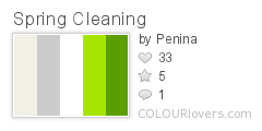
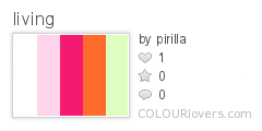
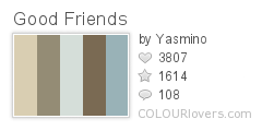
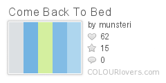
Just while writing this post I found these five great color palettes:

Spring_Cleaning

living

let_them_eat_cake

Good_Friends

Come_Back_To_Bed
Colors by COLOURlovers

More Resources

Are you ready to go find new colors for your site or for your next design? Trying to find the colors on your current site? Just love color? Here are some great resources:

Color Combos
Color Scheme Designer
Color Schemer

I could keep going but you can see a comprehensive list at Aviva Directory.

[box type=”info” style=”rounded” border=”full”]Originally posted on my blog at Uniquehorn Designs, but that blog will be closing and moving to PepperScraps.[/box]

7 Elements of a Blog Blogging

5 Ways to Visually Improve your Blog Posts

5-visual-improvements-for-blog-posts

Have you ever come across a blog you loved what they were saying but just trying to read it exhausted you?

You have 3 seconds to impress your readers. Even if you have caught them by your web design and your headlines if you haven’t take these 5 simple steps in improving your blog posts your readers are going to leave.

1. White Space
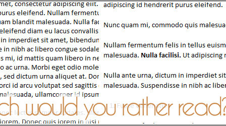
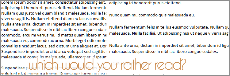
In art and design there is a term called white space. This does not mean literally the color white. But just empty space, with nothing in it. This gives the eye a place to rest.Make sure that your blog design has space between each line (aka line-height). You also want to have a good amount of space between your paragraphs. Putting space around even your images will make a difference fo your readers when looking at your blog.

2. Short Paragraphs, Short Sentences.
When someone looks at your blog and see a wall of words, they become overwhelmed and tired just thinking about reading your blog post. Most readers only skim posts but if they see the wall of words they may just skip it all together. Use short sentences.

Make your paragraphs are short. They should only be a few sentences each. You cannot overdo paragraph breaks!

You can even make a paragraph just one sentence.

3. Edit, Edit, Edit
Make sure and edit your posts. Read your posts out loud and really listen to what you are saying. Can you write your sentences shorter? Can you use less words to make the same point? Less is always more and in blogging this is even more true.

4. Use Your Tools!
Use the edit tools in your blogging control panel. Make the key point in a paragraph bold. If you want to emphasize a point put it in italics. Most readers only skim text on websites. These emphasized points may catch their eye and encourage them to read more.

5. Lists
Use lists whenever you can. If you are joining in on the 31 days to Build a Better Blog then you have just learned that lists are great blog posts. But make sure even your lists are easy to follow. Try using bullet points or number your list. Make sure each item has its own line! Even when making a list and then expanding on each point your list item should have it’s own line.

Your Turn

Try out some of these tips on your next blog post and take a look at the difference. Does it look nicer to you? Did more people stop and comment on your post? Did you notice people even commented about something in the middle of your post vs the beginning and the ending?

I would love to see your posts showing off your editing skills, please comment and share your experience with me.

Blogging How to Start a Blog

How to Slowly Invest in your Website


Investing in your website can be costly. But if you want your readers and advertisers to invest in you, you need to make an investment.

After making the decision to start redesigning you may find that the cost is outside of your current budget. This may make you feel that you need to put off your redesign or not do it at all. But before you put off your new look consider this:

Consider slowly investing in your design. When you look into breaking the design down piece by piece you will find that you can slowly afford an amazing design.

Before you Start

Just as Leo Babauta talks about branding your blog’s personality as a whole in Branding 101, you need to think about how your new look  represents you also. Really draw a picture in your head of what you want and what really represents you and your blog.

You want to look at your design from the start as a whole, not as each element as you invest, because in the end you want it all to fit together seemlessly. You will also want to make sure you use the same designer throughout your design.

Picking your Designer

That brings us to our next step which is to find a designer that fits you and your style. You can do this by interviewing them, checking out their previous work and asking for a mock up.

One of things to ask while interviewing them is if they would be willing to spread your project out and how they would recommend going about this.

Don’t skimp on your choice of designer just because of their prices. A true professional designer is going to have a high prices due to their skill level, their education, their investment in computers and programs, and their demand. But you will see something different in a designer that is charging a premium price. They are going to spend the time to get to know you and your product and your vision. They are going to give you a premium product that will amaze you and your readers.

Breaking up the Cost

So how do you break up a new design?

You can break each element out and spread them apart to help you make your slow invest. You can get the prices for each element from your designer and how they would prefer to break it up.

A good example of how you can break up your design is to first invest in a professional logo, then a blog header, maybe a twitter background and a facebook page, and then finally a customized theme.

Logo Design – Your logo is going to be used on everything from your site to your business cards and it will nail down the feel of  the rest of your design.

Header Design – You may actually find that you don’t need a header design when you are planning your overall design. Some magazine themes and professional sites are now mainly using their logos as a header and leaving more room for content on their site. This is one reason it is a good idea to have a plan before you start.

Twitter Background and/or Facebook Page – When planning out your overall look think about the different elements you will need for your site and each piece that you will need. I highly recommend you have all your social media match the design and feel of your site.

A Customized Theme – You have lots of different options when it comes to your theme for you blog. Learn about the different levels of investment you can make in your theme design in my previous article, Beauty vs Budget.

As you purchase each piece of the design make sure you are saving up for the theme design, because this will be the largest investment. But this way you will be able to slowly make the changes to your site, your readers will see your investment and start recognizing your new brand!

Payment Plans

Another option to consider is payment plans. Ask the designer that you are interested in if they would be willing to take your project on with a payment plan.

They may do this in a few different ways. They may wait to start the design until you have paid in full or half down. They may be willing to design while you make your payments but will not release the files until everything has been paid.

Make the Plunge

When you are ready to take your site to the next level make sure that you choose a professional designer and don’t be afraid of their prices. Because you will be surprised at your return on your investment if you make the plunge. A truly well designed site will drive in the readers and investors as you would never have imagined.

If you feel that a professional designer that you love is out of reach think again and consider your options and consider slowly investing into you new design.

More Questions?

I’m always happy to help with questions so feel free and ask here in the comments or email me at (unicornbeauty (@) gmail.com)

7 Elements of a Blog Blogging

How 5 Words Can Help You Build Your Brand

I have been participating in a great series over at SITSgirls: Think Like a Marketer. Last week we started by focusing on the branding of our blogs. I loved this article because when I work with my graphic design clients I have to explain to them that branding is visual and conceptual. When I’m helping someone build a blog I explain how color and logo will work building their visual brand, but that they need to build their conceptual brand also. I loved that Melissa (@momcommblog) really got this point across so well in her article. The homework for this week was very revealing and a great growing experience. I will be going through the steps to share my experience as I worked on my homework. I hope this shows you how this can really help you to improve your brand and blog.

Your 5 Words

The first part of the homework was to write down five words that you want people to think of when they first see your blog. This was a little hard at first but once I started the words just kept coming. My five words:

  1. Interesting
  2. Inspirational
  3. Informational
  4. Stylish
  5. Clean

Their 5 Words

Now I did not share these words with anyone and I started doing part two of the homework. I jumped on twitter and started asking others what five words they thought of when they saw my blog. Here are some of the responses I got:

subdued, organized, simple, straightforward, great logo! by @stephmommybrain

Clean, Modern, Fresh, Diverse, fun by @MamaofAllTrades

Sylish, Clean, Narrow, Engaging, Personal by @PhotoLynda

organized, pink, uncluttered, variety, interesting layout by @Modern_Gypsy

simple, organized (i love each post has its own box), clean, colorful (but not too much) and easy (to navigate) by @OurTypicalLife

organized … creative … variety … honest … feminine by LifeLovesLeah

girly … organized … honest … plain … mom by ThoughtsFromHer

These are just some of the few that I received, but you can see that specific words started repeating: clean and organized. That’s great I’m really happy to find that my blog gets described as this! My style for my graphic design business is exactly this: clean & organized, so this is branding my blog for my business. Perfect!

Growing and Learning

Now, time for me to take this information and start learning and growing. One of the words that I’m missing is: Informational. I need to start working on growing this concept on my blog. One of the things I think I need to work on is my post titles. I need to work on communicating more about the benefits my readers will get from reading my blog. If I had awesome post titles this should communicate to visitors that Pepper Scraps is  informational and educational.

Now Your Turn

Did you participate last week? What did you learn from your words? Do you need more words? Feel free and ask me in my comments and I will be honest with you.

Photo by Cappellmeister
Birthday Christmas Crafts Easter Crafts Father's Day Crafts Free Printables! Mother's Day Crafts St Patricks Day Crafts Valentine's Day Crafts
Eggshell Mosaics: E is for Earth & Eggshells
Easy Owl Donuts!
Free Printable Star Wars Valentines
Appetizers Baking Bentos Beverages Breakfast Dessert Dinner Kids Lunches Lunch Salads Side Dishes Snacks Soups
Healthy Broccoli Salad
Spaghetti Squash with Peanut Sauce
Easy Owl Donuts!