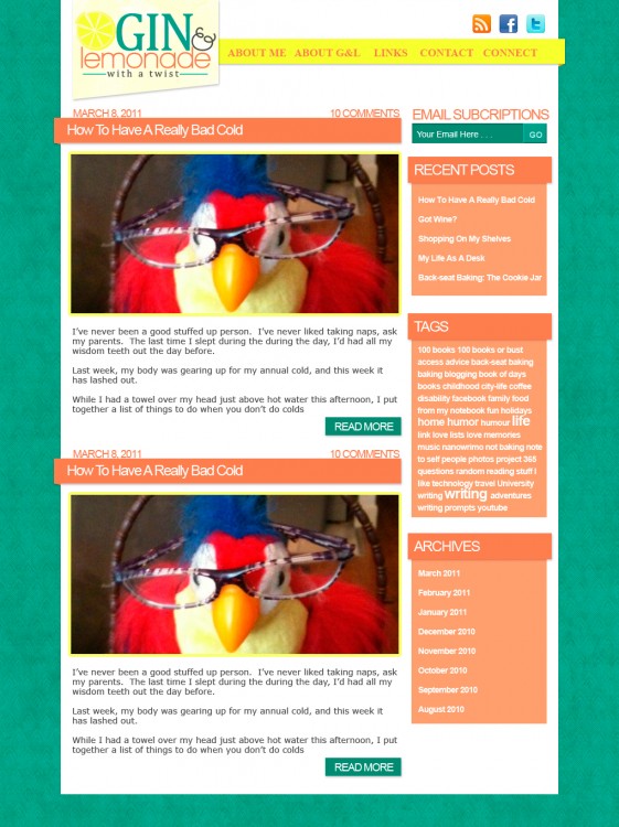
This is the second makeover in my new series: PSD Makeover. This month’s volunteer was Lorna at Gin & Lemonade.
THE PROS
- A very basic layout that is easy to follow
- Menu is easy to find and links are very easy to understand
- Sidebar is pretty clean and not too cluttered
THE CONS
- The site is too basic there is no real color or personality
- No real logo
- Social media is spread out between a page and in the sidebar
THE PLAN
Create a logo that was bright and fun.
Add some color and style. Pull the color scheme from the logo to showcase the fun name of the blog.
Bring in some texture with the background and banner under the logo.
Add the social media icons to the top of the site above the menu where visitors can find it quick and link up.
Keep the layout basically the same but excerpt the blog posts to make less scrolling.
Also included a designated place for photos to make the posts themselves pop.
Make the email subscription sign up bolder and stand out more.
Bring in the same style and color scheme into the sidebar.
THE REDESIGN
YOUR INVITED
I am looking for anyone who may be interested in participating in a PSD makeover by Uniquehorn Designs. If you are interested post in the comments with the link to the site you would like redone!
[box type=”info” style=”rounded” border=”full”]Originally posted on my blog Unicornbeauty, but that blog will be closing and moving it to PepperScraps.[/box]


OMG Pepper!! I love the redesign.. Those colors just automatically make me think of warm weather and drinks with umbrellas.. Beautiful work my friend!
Thanks Tina I really appreciate your input, especially since you put into words my artistic feelings about this design that I couldn’t. LOL
Sometimes I can make something and know that it just fits but not tell you why. It’s a feeling something inside me I can draw/paint/or design it but not say it. You are so right it’s because this design has the feel of drinks out on the beach under a tropical umbrella!
Oooo me me me me me! I would really like a redesign makeover for my wordpress blog here : http://www.kerplinky.wordpress.com. That redesign is absolutely fabulous. Of course the title of the blog Gin and Lemonade is too but is it possible to hire you to create a title for my blog too? lol I don’t know about Prompt and Circumstances .
It looks awesome 😀 I wish I was that good…
Aaw! You are good, you just need to get PS!
Thanks! Only just noticed this, will implement some of the changes. 🙂
Lorna